1. The first idea was to have the titles written on a piece of paper attached to the package, which would be in the hand of the person who dies at the end of our film. The shot we took panned out from the title to slowly reveal the hand holding it, however after following advice from Jon (our media teacher), we decided to abandon the idea on the thought that it looked unprofessional and too 'studenty'.
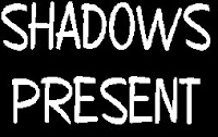
 2. The second idea was to keep the handwritten appearance from the first idea, but use a professional font instead. For this our options were 'Copybook' (shown on the left), 'Brush Stroke 26', 'Bradley Hand ITC' or any other similar examples. After applying the title to our film, we realised it didn't look very noiry and gave connotations of a comedy or children's film instead of a dark crime/horror noir sequence.
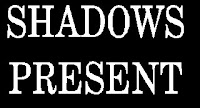
 3. The third idea was to choose something more gothic and detailed. For this we'd use 'Annual' (shown on the left), 'Copperplate Gothic', 'StoneSerif.1 Gothic' or any other similar font. I liked this font style as it suited the noir genre and introduced our film title nicely according to the previous action shown. However, there were still other ideas that could work just as well, so I looked at these first.
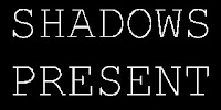
 4. The fourth idea was to choose something simple but looked like a typewriter, to give the impression that someone is present and has just typed/written it onto the screen (like in the first and second ideas above). For this we used a font called 'Perpetual Elite' (which is similar to 'Courier New' - shown on the left). The font suited our film noir, and is similar to the titles in the opening sequence to the film 'Se7en' (as analysed previously). We decided to put the font into size 86.0 for the production company titles at the beginning, and size 70.0 for our names.
5. Once satisfied with the font choice, we tried to apply some sort of title effect that would create the appearance of a shadow walking across the font. After a long time of fiddling around, cutting bits of the title and inserting different effects, we decided that our ambitions were set too high and it wouldn't be worth it after all. So we then decided that the font could change colour to red. This would give connotations of blood and death, and would be a nice touch to the end of our sequence, but the beginning of the film. We kept the same font but changed the colour to red. We placed the titles next to each other in our film timeline, and applied a fade transition between the 2 titles. We then applied a 'blur' vidoe effect to the end of the red title to disorientate the audience and add a noirey touch. We showed the rest of our group and we all agreed that this effect worked well.
So above are the few ideas we had as a group, and ideas I had myself. Each idea is good in certain ways, but had to match the noir genre for it to go well with our film.
So above are the few ideas we had as a group, and ideas I had myself. Each idea is good in certain ways, but had to match the noir genre for it to go well with our film.
No comments:
Post a Comment