Film Noirs often begin with a set up of the mystery or enigma and this was our objective in this film opening. We also wanted to maintain genre conventions by including a main protagonist who is established as the main character in the film by focusing lots of close up on him. Additionally, our narrative included a flashback which is a typical genre characteristic in Film Noir but we did not include a femme fatale as we wanted to concentrate on the confrontation between our main protagonist and his stalker. This meant that in this respect we defied the narrative expectations of the genre but still maintained many other genre characteristics.
We looked at other Film Noir openings such as Michael Clayton (Tony Gilroy, 2007) and Seven (David Fincher, 2007) which both include a limited amount of information so that the audience is intrigued to find out more about the plot. We also looked at classic Film Noirs such as DOA (Rudolph Mate, 1950) which include more information and serve to set up the plot and allow the audience to feel like they want to know the resolution. This research served to give us a decision to make about which of these styles we would use. In the end we went for a more classic style and approached our film opening as if it was a scene from the nearer the end of the film. Another technique we used from classic Film Noirs was the voice over. We felt it served to give clues as to the nature of the main character whilst at the same time allowing us to show more action on the screen which is more helpful in establishing the overall story and plot. Sticking with a tradition of more modern Film Noirs such as Kill Bill we showed a murder taking place which is intended to set up the mood of the film which like almost all Film Noirs is dark, mysterious and somewhat uncomfortable.
In terms of editing we started the film with a short sequence in the exterior location and then flicked to the action happening in the interior location. Then what we did was to cross cut between the man sitting at his room and him fleeing through a forest and we made sure the audience was sure that the forest was a flashback by showing the package open in the room and closed in the forest. Our cinematography in the room used artificial low key lighting, which we able to control, in order to create a slightly threatening atmosphere and shadows were deliberately shown on the main character's face, in our many close ups, to show his conflicted character and as it is a Noir tradition. In the forest we used naturalistic lighting, partly because artificial lighting would have been too difficult with our limited budget, in order to make the character's decision to take the package more realistic. In terms of sound we experimented with a more high tempo soundtrack during the forest scene but in the end we went with a more subdued sound so that that section didn't seem like a trailer. As a result our soundtrack has a darker and possibly more subversive quality to it which in retrospect is more in keeping with the traditions of Film Noir. Finally, our 'killer' wears dark clothing and his face is never revealed which is often the case in Film Noirs.
There are only two characters in our film opening and one of them, the stalker, is never seen properly so his age is a mystery however we created his menacing demeanour by using mid shots in the forest of him holding a knife, a dark hoodie which has connotations of threatening behaviour and his speech which makes frequent reference to revenge and death. We also used quicker editing on the stalker so that it was harder for the audience too see him in more detail thus ruining some of the mystery. We also made sure that he kept to the shadows especially in the interior location so that he kept out of the main light and finally we made sure his costume was mainly black as that colour has connotations of shady deeds and firmly established him as the villain.
Our main character, by the use of his smart casual clothes, is meant to represent a student or possibly a young professional. He is also sitting at a desk in what is meant to be his office or study, as shown by the props which included a pad, paper and a fan. This would indicate that the plot will focus more on younger people and their issues. We created this representation of a smart young adult because we wanted the theme to be about whether or not a smart mild young man would risk his life in the pursuit of wealth which is contained in the package. Another way we created this representation was through his voice over which gives clues as to his temperament and possible regrets but also has the tone of someone more mature. The issues in our film are about greed and crime which are issues in some teenagers' lives but at the same time we wanted our film to have more of a hyper-real tone meaning that relevant issues were showcased in a more poetic manner like some of the films of Martin Scorcese such as The Departed for example.
Our film was low budget and was an independent production. It had a fairly typical Noir narrative which will probably mean that it will attract a fairly limited audience and as result only be distributed by a small film company such as Optimum Releasing (which has released films such as Gomorrah and Eden Lake) or BBC Films (which has released films such as Billy Elliot and Eastern Promises). Also its exhibition and exchange will probably be restricted to film festivals where a more diverse range of films are shown or maybe even in an art house cinema. Hopefully it will gain profile via positive critical response and good word of mouth which are converted into social coinage and help to spread the film across the country in a platform release. Eventually our film may turn up on a specialist film TV channel like Film Four or maybe even one of the smaller BBC channels like BBC 4 or even 2.
During pre production we conducted research about the film tastes of many people aged from 15 to 21. We did this because as our group was in this age range these are the people of whose tastes we could most identify and therefore produce something that would appeal to them. This age range would typically be in the lower to middle class so the contents of our film were aimed to represent issues that related to this age group and that's why we chose a storyline that was about eagerness for money and the possible moral compromises that occur because of it. Also, we have a murder in our opening but it is shown off camera and there is no blood involved and that coupled with a lack of swear words in our dialogue means that our BBFC rating could possibly be no higher than a 12A or at most a 15 which means that none of our target audience would be restricted from seeing it. To be more precise we believe that more men will be in our likely audience as typically men prefer films that involve darkness, murder and crime and this may also include established fans of Film Noir who will be part of genre communities.
Our audience research suggested that modern audiences in our target age group were in favour of faster paced narratives and maybe even more action scenes. As a result we decided to make our own film opening go at a reasonably fast pace with the scenes in the forest being cut more quickly together. This is in order to grab the attention of the audience straight away and we tried to keep them hooked with the use of an enigma at the end which is a common Noir technique and has been used in other film openings such as Double Indemnity (Billy Wilder, 1944). The influence of a modern audience was also felt in the use of our music and costumes. We decided to keep the costumes fairly naturalistic and in keeping with modern styles rather than reverting back to some sort of private detective's outfit which is rooted in the history and traditions of Film Noir. However our use of more poetic dialogue was a hark back to Noir traditions and it was our way of using iconic characteristics of the genre but updating other areas in order to attract a younger audience. Additionally, the thriller aspect of our plot should also target audience members in the B and C range of social demographics who will respond to the intellectual puzzles. Finally, people in the D social demographic may respond more to the emotional pleasures of the film as they are nervous to see who gets killed next.
When we screened our film to an audience in the target age group they were mostly pleased with the result and we had positive feedback on aspects such as our choice of exterior location as people like the aesthetic of the wooded area as it symbolised mystery and intrigue. They also praised a section where we used hand held cameras saying that it added urgency and drama to the film. However, we did receive some criticism which included some slight confusion over the narrative. A couple of people were unsure which location was the flashback which may indicate a fault with our editing as we have a brief glimpse of the forest right at the start and then flashback to it later. Also, some people thought that the interior location, which was set up to look like an office, wasn't suitable for our character's age. They suggested that somewhere like a bedroom might be more where you'd expect to see a teenager in a film and this suggests that we didn't satisfy the expectations of our target audience. Continuing this theme they also said that our voice over and dialogue wasn't very naturalistic and meant that the audience struggled to identify with the characters. We thought that the more poetic speech might be a twist on Neo Noir but our target audience didn't agree. Finally, they said that the sound of the fight scene didn't sound realistic which was a problem we were already aware of but struggled to fix as we didn't have professional actors and we found simulating that sort of atmosphere artificially extremely difficult.
For our film we used a CANON HV30 DV camcorder which was our third exercise using it and we felt much more comfortable using it than we had previously and we saw the benefits of it as it enabled us to shoot quickly and get the right shots with minimum fuss in our limited time frame. We also used a YOGA shotgun microphone, a boom pole and headphones which allowed us to capture naturalistic sound on location and keep check on its quality. Additionally, we used a VELBON DV-7000 tri-pod which allowed us to utilise panning shots effectively and to cut out unwanted wobbly camera movements which may have detracted away from the main story taking place on screen. As well as that we used a 300W light and a gobo to create a Venetian blind effect on our main character's face which served to represent his troubled personality. It has also been used in classic Noirs such as Detour (Edgar G. Ulmer, 1945). Finally, we used Adobe Premiere Pro for editing as it allowed us to experiment with different versions of our film. We then had to compress our films onto smaller files so that they would be accessible on our Blogs.
We have had two exercises prior to this, a simple 20 second dialogue scene and one and a half minute film with two characters exchanging a package. Our previous exercises have shown a clear lack of knowledge in practical areas such as camera use. However by extensive practice I believe we now have a fuller understanding of the possibilities and limitations of the camera. Specifically we have become more aware of framing and of wanting to use more close ups as I believe they are vital in giving the audience a clear interpretation of our main character. As well as that, in previous tasks we have kept to very basic editing and only showing necessary information but this time we put in cutaways of the package to show its position in relation to the characters as well as highlighting its importance to the narrative and we had an insert edit of our main character's eyes when that word appeared in the voice over. This meant that the word had a greater dramatic emphasis. We also made sure we put in hard lighting during our dialogue so that the dangerous situation we were trying to show came across that way to the audience as in previous exercises we used entirely natural light.
As for working in a group, we were given more time in pre production and this allowed us to bounce more ideas off each other and have more time to contemplate and fully assess decisions such as the specific narrative and how our cinematography would best serve it as well as deciding which locations to use as well as deciding on props and costume that would be suitable. In previous tasks we have had to make rushed decisions and have been unable to examine the micro elements in such fine detail. We also learnt that these micro elements are key in establishing a Noir genre in that hard strobe lighting, flashbacks and cross cut editing, and Dutch tilts are big indicators to our audience as to the tone and genre of our film. Finally, we learnt that our ideology had to be about moral decisions and violent behaviour in order to keep to our genre and that making our teenage characters act in this way was vital in creating a representation people could either relate to or enjoy watching for visceral pleasure.
Thursday, 30 April 2009
Shadows Present
I had trouble uploading my final piece on to my blog so please follow this link and select Shadows Present- Final Edit.
http://www.youtube.com/chriskenworthy
http://www.youtube.com/chriskenworthy
Tuesday, 28 April 2009
Applying For Use Of Our Music
If we were to finish the rest of our film noir and publicly release it into cinemas worldwide, one of the things we would need to apply for is permission for music use. This is because we haven’t created our own music to use in our opening sequence, as we are using the song ‘Clues’ written by Jan Hammer. PRS (Performing Rights Society) acts as the agent between our film production company ‘Take Two Productions’, and Jan Hammer, as they ask the owner of the music if we would be able to use in our film opening. To apply for music use, we would have to log onto the PRS website (www.prsformusic.com/Pages/default.aspx) and apply using an online application form. On receipt of our request PRS would then contact Jan Hammer and ask for his permission, and negotiate a price we would pay for use of his music. We would need a broadcast licence for a feature film for commercial use only. I entered the name of our production company, our film title, a brief synopsis of our film and various other information, so that PRS can inform Jan Hammer the specific use of his music. Then I entered the piece of music we wished to use and who PRS would have to ask permission from to enable us to use it.
Below is a scanned version of the details I was intending to submit to ask for music use permission: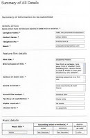
Below is a scanned version of the details I was intending to submit to ask for music use permission:

Looking at Titles and Fonts
In our film we have chosen to place the main title, 'Shadows Present', at the end of the sequence. We found this popular with many films and we thought it would create an enigma for the audience and keep them watching to find out what the film is called. However, as editor it is my responsibility to choose a suitable title font that will match with the noir style and be interesting for the audience. The same chosen font will then be applied to our name titles (which will be shown during our final fight scene and between the running through the forest) to show continuity throughout. We have also had a group idea that the actors' names should appear during the woods scenes, but are unsure if this idea will stay as it is not neccessary to have too many short unreadable titles disturbing the film, rather than a few good readable titles that break up the action nicely. For the background to our titles we had already decided upon black as it would make the text stand out and would match the noir style. Below are some of the font ideas and the reasons behind them: (the font examples shown below aren't the same as the ones we looked at in the editing suite, but they are very similar. You might have to click on each font example to see it more clearly as the quality isn't very good)
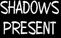 2. The second idea was to keep the handwritten appearance from the first idea, but use a professional font instead. For this our options were 'Copybook' (shown on the left), 'Brush Stroke 26', 'Bradley Hand ITC' or any other similar examples. After applying the title to our film, we realised it didn't look very noiry and gave connotations of a comedy or children's film instead of a dark crime/horror noir sequence.
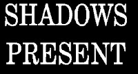 3. The third idea was to choose something more gothic and detailed. For this we'd use 'Annual' (shown on the left), 'Copperplate Gothic', 'StoneSerif.1 Gothic' or any other similar font. I liked this font style as it suited the noir genre and introduced our film title nicely according to the previous action shown. However, there were still other ideas that could work just as well, so I looked at these first.
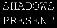 4. The fourth idea was to choose something simple but looked like a typewriter, to give the impression that someone is present and has just typed/written it onto the screen (like in the first and second ideas above). For this we used a font called 'Perpetual Elite' (which is similar to 'Courier New' - shown on the left). The font suited our film noir, and is similar to the titles in the opening sequence to the film 'Se7en' (as analysed previously). We decided to put the font into size 86.0 for the production company titles at the beginning, and size 70.0 for our names.

1. The first idea was to have the titles written on a piece of paper attached to the package, which would be in the hand of the person who dies at the end of our film. The shot we took panned out from the title to slowly reveal the hand holding it, however after following advice from Jon (our media teacher), we decided to abandon the idea on the thought that it looked unprofessional and too 'studenty'.
 2. The second idea was to keep the handwritten appearance from the first idea, but use a professional font instead. For this our options were 'Copybook' (shown on the left), 'Brush Stroke 26', 'Bradley Hand ITC' or any other similar examples. After applying the title to our film, we realised it didn't look very noiry and gave connotations of a comedy or children's film instead of a dark crime/horror noir sequence.
 3. The third idea was to choose something more gothic and detailed. For this we'd use 'Annual' (shown on the left), 'Copperplate Gothic', 'StoneSerif.1 Gothic' or any other similar font. I liked this font style as it suited the noir genre and introduced our film title nicely according to the previous action shown. However, there were still other ideas that could work just as well, so I looked at these first.
 4. The fourth idea was to choose something simple but looked like a typewriter, to give the impression that someone is present and has just typed/written it onto the screen (like in the first and second ideas above). For this we used a font called 'Perpetual Elite' (which is similar to 'Courier New' - shown on the left). The font suited our film noir, and is similar to the titles in the opening sequence to the film 'Se7en' (as analysed previously). We decided to put the font into size 86.0 for the production company titles at the beginning, and size 70.0 for our names.
5. Once satisfied with the font choice, we tried to apply some sort of title effect that would create the appearance of a shadow walking across the font. After a long time of fiddling around, cutting bits of the title and inserting different effects, we decided that our ambitions were set too high and it wouldn't be worth it after all. So we then decided that the font could change colour to red. This would give connotations of blood and death, and would be a nice touch to the end of our sequence, but the beginning of the film. We kept the same font but changed the colour to red. We placed the titles next to each other in our film timeline, and applied a fade transition between the 2 titles. We then applied a 'blur' vidoe effect to the end of the red title to disorientate the audience and add a noirey touch. We showed the rest of our group and we all agreed that this effect worked well.
So above are the few ideas we had as a group, and ideas I had myself. Each idea is good in certain ways, but had to match the noir genre for it to go well with our film.
So above are the few ideas we had as a group, and ideas I had myself. Each idea is good in certain ways, but had to match the noir genre for it to go well with our film.
Thursday, 26 February 2009
Editing
EDIT 1
This week we began logging and capturing our footage. The exterior scene seemed to come out fairly well and it will now be a job of determining the pace and adding on approiate music. There seemed to a small amount of trouble with the interior scene but hopefully we can devise a solution.
EDIT 2
On this edit we added on the dialogue and music to accompany it. In places the sound wasn't loud enough and our voices were drowned out which meant that we probably had to re-record the dialogue. Also the first music choice we had, 'Mausum Escape', sounded a bit too much like indian music and meant that it probably didn't fit in with the tone of our film.
EDIT 3
On this edit we re-recorded all the necessary sound such as dialogue, voice over, the struggle and light switches and placed it on our film. We also put on titles for the first time and this meant that we thought the film was starting to come together.
EDIT 4
After showing the film to our lecturer, he commented that the pace of the film (the editing and high tempo music) made it seem more like a trailer than the opening of a film noir. Our group experimented with different music as a result and found that a slower tempo track, 'Clues' (our eventual final choice), worked better as it gave the film a darker more mysterious and possibly more threatening tone. However some of our shots still seemed a little jumbled in terms of narrative and the pace was a little eratic.
EDIT 5
Our director suggested that we could place the interior shots first to establish the character and then proceed to the exterior shots rather than cutting between them. This helped to establish our main character and made it clearer that the exterior shots were a flashback.
EDIT 6
We had arranged all the scenes and had finalised the music and voice over and proceeded to screen it to some of our fellow classmates. Their response was mainly positive but they did point out a couple of sound errors which needed to be corrected as well as tidying up a few transitions. They seemed comfortable with the story and the enigma of what the motivation was for the 'stalker' to lay the trap on this man and which of the characters was killed at the end of the struggle.
FINAL EDIT
We made the necessary modifications to sound and cuts as well as finalising the order and look of our titles. We then screened the film to the rest of our class for feedback which would enable us to write up our evaluation.
Wednesday, 18 February 2009
Filming
On wednesday 5th February and wednesday 12th February we filmed our film opening. On the whole everything went according to plan and our careful planning paid dividends and empahasised its necessity.
On the first wednesday we filmed our exterior scenes on location at Alexandra Park. Thankfully the weather was perfect, if a little cold, and we did not have to alter any of the shots we wanted to get. We were careful to get as much coverage as possible and ended up with around 11 minutes of footage for what we plan will be only around a minute of screen time. Chloe was in charge of sound recording whilst the rest of us alternated the use of the camera depending on which of us needed to be in shot as an actor. As planned we each used a variety of high and low camera angles, dutch tilts and long, wide and mid shots as well as several close ups. We tried to use natural lighting to give a more realistic effect to this segment.
On the second wednesday we used the studio for our interior scene. The use of the studio allowed us more control over lighting and the general look of the piece. Because Chris was required to be in shot constantly he was unable to use the camera but instead served as an overviewing director and held sway over each decision. Chloe was once again in charge of sound recording whilst I operated the camera when I was not on screen with Emily being in control when I was in a shot. We utilized additional props that were available to hand to further decorate our desk to make it look more authentic whilst we used external props for the key narrative devices. The shoot took around 4 hours because we required more footage than for the exterior segment.
Tuesday, 3 February 2009
Our Location


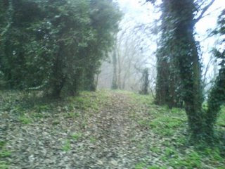
These are photographs of the wooded area to the rear of Alexandra Park. I felt the secluded nature coupled with the slightly ominous trees would create a good visual style for the scene involving the discovery of the package. It also has a similar look to the opening of the film Michael Clayton which was one of the titles sequences which influenced the script.
All of our crew scouted the location two weeks before filming and deemed that the location met all of our projects' criteria both creatively and in terms of safety and availability.
Subscribe to:
Comments (Atom)
